

pictured here are some of the envelopes sent in by jake. the zigzags are new to me but so is the envelope in the front, which is covered in overlapping numbers. such designs bring up an interesting (to me) dilemma. when i first set out on this project, i was drawn to the abstract nature of the designs inside envelopes and wanted to highlight their beauty. but patterns like this (or some beautiful ones that say 'air mail' in various languages, 'thank you' or other similar messages) challenge the parameters of the project in my mind. they are not disqualified for being corporate, and yet they present recognizable symbols which are at odds with my initial vision for the project. i do recognize this distinction as being purely aesthetic and not at all ideological, so it seems wrong to punish these plucky envelopes simply for being more populist. the solution i have come up with, is to retain these designs for a second, later release of sets with words and symbols on them. to me, this makes them an even more special, rarefied collection and will hopefully give this project and eventual second wind. thank you for suffering my struggles, folks.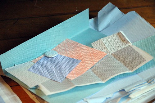
but back to questions of corporate interference in artistic life...i have received more than a few envelopes with tiling logos inside them. not to say that i am ungrateful for the contributions i have received, they just find a way of slipping in. some have come in large contributions, masterfully camouflaging themselves in bulk; some sport logos so simple as to look abstract when tiled; and some just look cool to begin with (the uk passport office logo jumps to mind). but even more insidious (and something i have just decided to incorporate into my project) is colour branding. that orange in the stack above is associated with come british company; a certain courier service has its own purple (which i quite like); there is a burgundy associated with another company (which i can't remember - sorry, your branding is less effective. i remember the colour but not you). and i bet there are even more branded colours that i haven't noticed. it's pretty tricky stuff. and it worked. i really wanted this project to promote the idea of (mostly) nameless designers and their subtle effects on our lives. instead, some stock patterns have been given a new colour that was, in some instances, agreed upon by rooms upon rooms of people. i guess being a corporate shill is much more inescapable than i had originally understood. at least this sneaky corporate intervention has provided my project a wider colour palette. sigh.
in cheerier, more forward-moving news, you may notice a recipe box in this last photo. this is where i am housing my burgeoning security envelope swatch collection. i hope to use this to scan patterns for online dissemination, scrutinize new submissions against the current collection and maybe even do things i have yet to think of. the future is now.
No comments:
Post a Comment